With over 41 million active users, Digikala is a leading e-commerce platform offering a wide range of products. However, grocery shopping presented unique challenges for users. This case study explores how Digikala addressed these challenges to create a more streamlined grocery experience.
Problem statement
Driven by the understanding that grocery purchases are faster and distinct from other categories, Digikala sought to gain deeper insights into user behavior within its grocery section. This aimed to unlock growth opportunities for the business.
Process

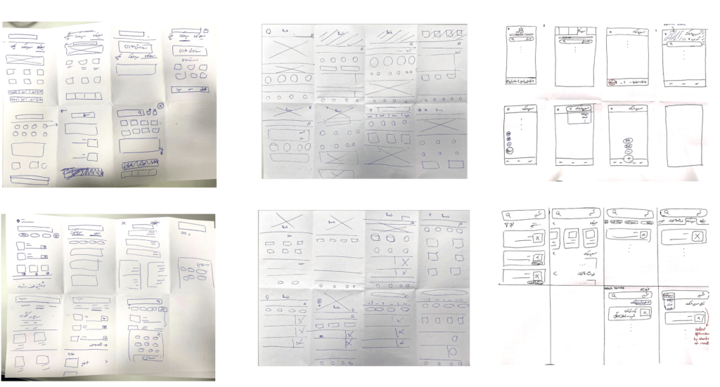
Discovery Research Plan
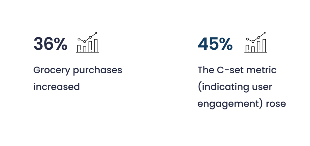
Goal: increase the purchase of supermarket items
Method 1: Contextual inquiry
Method 2: Survey
Target group: users from those who had previously added grocery item basket
study 1: 6 users
study 2: 385 users
Main questions
what specific problems and needs do users encounter when utilizing Digikala’s grocery service?
User Pains
Limited product discoverability: Users find it difficult to browse and discover new groceries on Digikala, limiting impulse buys and exploration.
Mixed search results hinder product discovery: Digikala’s grocery search mixes grocery & non-grocery items, frustrating users and hurting conversions.
Inconsistent checkout process for mixed baskets: Mixing groceries & non-groceries at Digikala checkout forces users to remove items, causing frustration & cart abandonment.
Survey
40% of respondents reported difficulty finding desired grocery items on the platform, leading to smaller basket sizes.
68% of users indicated difficulty identifying their desired grocery items in search results.
over 90% of users would prefer separate checkout processes for grocery and non-grocery items
We came up with an idea! Streamlined Grocery Experience dedicated grocery experience with separate homepages, search functions, and shopping carts.
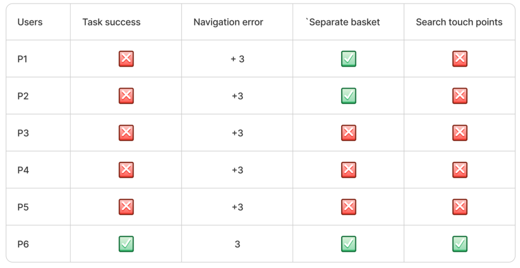
Usability test Plan
Goal: Evaluate the usability of the proposed separate grocery experience on Digikala’s platform
Method: Qualitative usability test
Target group: 6 users from those who had previously added grocery item basket
User Pains
- Lack of Awareness of Entering Grocery Section
- Misinterpretation of Grocery Search touch points
- Confusion Around Separate Grocery Baskets:
Test Result
HMW
- How might we Indicate a clear transition to the separate grocery section to prevent user confusion and maintain a smooth shopping experience?
- How might we design grocery search touch points to communicate their function and avoid misinterpretation as promotions?
- How might we design a checkout flow for mixed baskets that allows users to easily separate grocery and non-grocery items,
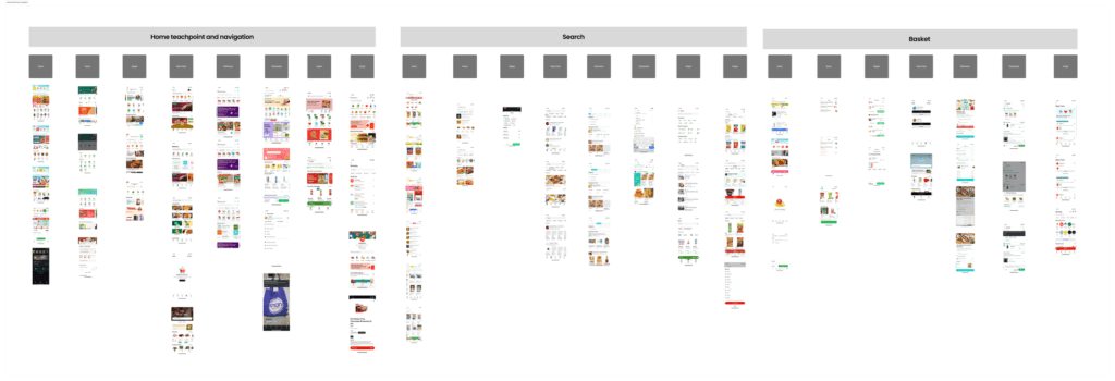
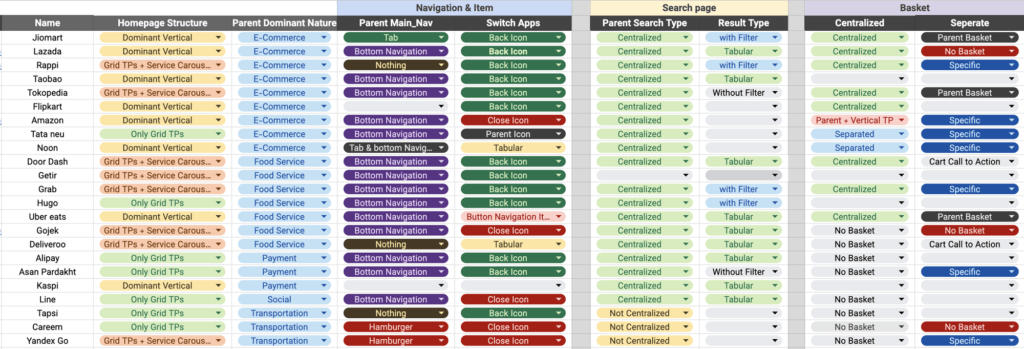
Competitive analysis
Crazy 8’s
Lack of Awareness of Entering Grocery Section:
Users entering the grocery section don’t recognize it as a separate area, leading to confusion and a disrupted shopping experience on the main app.
Misinterpretation of Grocery Search touch points
Touch points offered within search results for groceries are misinterpreted as promotions instead of navigation to the dedicated grocery experience.
Confusion Around Separate Grocery Baskets:
Users are unaware of separate baskets for groceries and non-grocery items, leading to frustration when items seem to disappear during checkout
Test Result

Result